What to Think About Before Building a New Website? Part 2: Sitemap & Content

In Part 2 of our series we look at Sitemap & Content. Missed Part 1? It was all about the groundwork, branding, and design.

Content and Sitemap

You’ve now spent some time thinking and planning a design for your new site, now we get into the actual pages and words within the site. Design is critical, yes, but here is how you share your story.

Sitemap & Content

SITEMAP
A sitemap is most simply a list of the primary pages on your website. There is usually a hierarchy with top-level and sub-pages. Your top menu will end up being a slimmed-down or best-of version of the sitemap. A sample sitemap looks like:

  • Home
  • About Us
    • Leadership
    • Company History
    • Careers
  • Our Services
    • Custom Furniture Design
    • Woodworking School
  • Blog
  • Contact

How many pages do you need on your site? As a general rule, we’d say as few as possible. If you are trying to cram too many ideas or too much info on a page, then it might be best as its own page. But in general, keep your sitemap lean, understandable, and something as easy to get a sense of as possible.

TEXT
Once you have your starting Sitemap identified, you need content for each of these pages. These words on a page will live within a certain design layout and might make use of photos, videos, and graphics.

The text is a key part of telling the story. It is also a key part of ranking in Google (more on that below)

PHOTOS
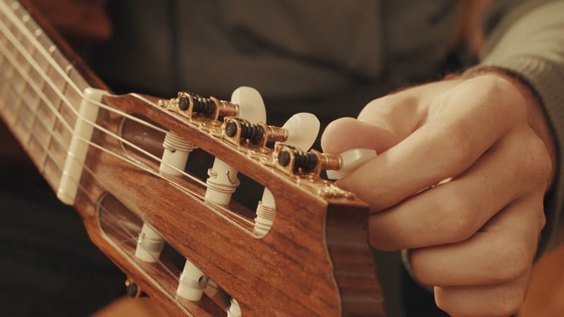
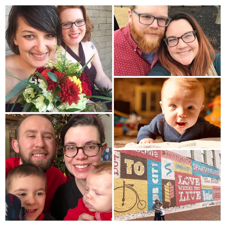
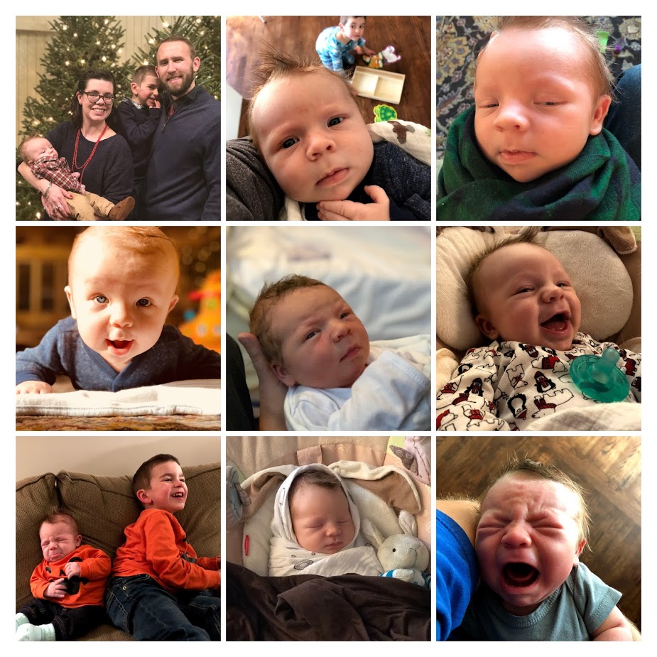
Having great photos dramatically helps a site feel well done. Ideally have a professional photographer take pictures but carefully chosen stock photography may also be used. We use BigStockPhoto for stock images.

PULLING IT ALL TOGETHER / LAYOUT
Once you have the text, photos, graphics, videos, etc. it is all about putting them together into a consistent layout.

Writing good copy is hard. Probably just as difficult is then transposing it into a page layout that your audience can follow.

Remember, people scan on the web! Make your content easy to follow by carefully using these tools within your web layout toolkit:

  • Headings and sub headings (h1, h2, h3, etc/)
  • Bulleted and ordered lists
  • Bold and italics
  • Buttons or hyperlinking to other content
  • Columns or rows
  • Use of backgrounds, textures, and colors
  • Photos, graphics, icons, and videos

…and MOST KEY, once they have made their way through the page, is there a next step? Don’t forget what you want them to do! Is there more content to go deeper, a call to be scheduled, an e-book to download or a contact form to fill out?

Sitemap, content, and creating layouts sound daunting? Contact us, and see if we’re a good fit for your project.

What to Think About Before Building a New Website? Part 1: Branding & Design

Starting from nothing and helping build a new website that has never existed before is one of our favorite endeavors at LimeCuda. All that exists is a blank canvas and we get to be the first artists to create an online portrait of a business or organization. The rush is like some caffeinated pill of creativity.

About to begin that new website journey? This article explains the first of three high-level areas to start thinking about.

The Groundwork

You need to have a company / organization name, yes, but what about the domain name? This is a critical decision that will follow you for years.

Does it need to be a .com, .org, or something else ? How long will the name be? Are there misspellings to capture? Is it readable? Find available names (and purchase) using a registrar like GoDaddy.

AUDIENCE
Spend some time writing out what the audience(s) of the site are, what you should communicate to them, what they expect, what they will need to do, and what are the next steps you want them to take.

Branding & Design

You need a professional logo. If hiring a branding agency or graphic designer isn’t an option you can use something like 99Designs to get a great logo / brand for hundreds instead of thousands.

Ideally, you have firmed up the following design elements by the start of the project:

FONTS
Use web-safe fonts like Google Fonts. A typeface can dramatically affect the feel of a website. Make sure it matches your brand personality.

COLORS
Color says a lot about a brand. Used effectively it is a powerful tool. You will end up needing to have color codes like #96c940 you can use on the web.

Think about what colors will be used most predominantly – will the site feel dark or light? What color would be most ideal for a Call-To-Action color e.g. buttons?

You can use a free color palette generator like Adobe Color to to generate a color ideas.

LOGO VARIATIONS
You’ll likely need full color, black and white, small versions for Social Media, perhaps different versions for horizontal and vertical, etc.

Ideally get source / vector versions from the artist to give you flexibility with scaling or with other people working on the brand down the road.


Need an expert to metaphorically hold your hand? Contact us, we’d love to hear about what you are building and if we can be a key part.

It’s 2019… Well, 2018, That Was Quick

Oh man, this year went by way too fast! I know it’s cliché to say but time goes by faster the older you get.

It’s time again for our yearly review post! It’s been a busy year, unfortunately our blogging here doesn’t reflect that… you can still find our 2017 year in review in our home blog feed. Goal for 2019, a return to blogging #resolutions!

At the beginning of 2018, we set our general goal of “doing great work for awesome people”. As part of that, we thought it would only be appropriate to “do great work with awesome people” which we meant “with” in the physical sense. As a distributed team, we can sometimes take the importance of face-to-face interaction for granted. So, this year, we made it a point to travel more and meet some of our clients on their turf.

HEY! HEY! It’s a beautiful day LA

Our first trip of the year was to visit the headquarters of The Foursquare Church in Los Angeles this February. This trip was planned in the middle of the project and gave us a great opportunity to reveal the work in progress, provide some initial hands on training, as well as do some further project planning.

It was also a great time of work and play where we got to sample some great food and beer, stroll down Hollywood Blvd, and visit the Griffith Observatory. This trip was also the first time Blake and Elizabeth were able to meet face to face.

Ben Franklin is everywhere

Our second trip this year was to the city of brotherly love. Blake and I took our families to Philadelphia to meet up and plan a kickoff project with CCEF. We met at their main office, a beautiful, historic building near the campus of Westminster Theological Seminary, and did several planning sessions for all aspects of the site with many people that we’ve only ever previously met via email.

We stayed in an interesting Airbnb in downtown Philadelphia. During the day, it was a great location with quick access to fun for the family and public transportation for us. However, we did get woken up to shouts of “Don’t Shoot!” early on one of the mornings.

It’s people! It’s made of people!

Our team has also grown in 2018! Stephen Dickinson is helping us with some design and front-end development. We’ve really enjoyed having him contribute to our client projects. He’s got an intentionality with his approach and takes the time to invest in tools for projects that make them easier (and better) to manage over the long haul. In his free time he also volunteers as a support moderator for the WordPress.org forums.

2019?

We’re one quarter in and it is looking like a great year. Excited to figure out more ways to quickly serve you, our wonderful clients. Onward!

On that note, we are looking to grow our team this year! If you’re interested, check out the latest posting for a Support and Technology Specialist.

Practical Starting Concerns for Web Accessibility

Practical web accessibility is a mindset. Accessibility, broadly speaking, is helping something be as usable as possible to a broad range of users – especially those with visual impairments. The following isn’t a comprehensive list of accessibility requirements for modern websites, but we do give a general mindset and high level checklist for ensuring we don’t overlook common items. This list can provide big improvements in the usability of a website for those with web accessibility concerns.

Starting Point: good content organization and proper markup

With CSS comes great responsibility. Styles can be used to completely manipulate a site’s layout and visually rearrange the site in a way that doesn’t match the actual flow of the content. For accessibility, we always strive for a logical layout for the site and the content so that if you removed all the site’s styling, you could read the site from top to bottom and it would clearly convey the intended message.

With this approach to readability, proper markup is also used to ensure content is assigned the appropriate value for its intended purpose. This includes: headings, forms, buttons, images, and links. When these elements are given the appropriate markup, it helps to define content hierarchy as well as tell screen readers more information about the content that is present.

Visual Concerns for Accessibility

  • For any text elements, ensure that there is enough color contrast between the background and the foreground color of the text. That way, you can ensure all text is legible for those even with minor visual impairments due to disability or age.
  • Ensure all image elements have “alt” tags for those that can’t see the image to know what that image represents. If image isn’t necessary for the content, include an empty “alt” tag (alt=””)
  • Ensure all action elements (buttons, links, triggers) have proper labels and present proper context so users clearly understand what happens when interacting with that element. No need to have title tags on these links as long as the linked text is clear and defines result of action.
  • Ensure there are skip links at the top of pages so those using keyboard navigation along with a screen reader can “jump” repeated elements like the navigation and instantly hit the page content for the pages they’re visiting.

Physical Impairments

  • Ensure keyboard navigation allows users to access all action elements on the page. This includes all elements of a navigation including submenu items that aren’t initially visible on the page.
  • Ensure there is enough padding and space on clickable elements on the page. That way users with some physical impairment that are still using a mouse can easily click on their desired actions with limited opportunity to click on the wrong elements.

Have a web project we can weigh in on? Drop us a line! 

5 Solid Ways to Fine-Tune a Blog

We’ve done a lot of WordPress blog optimization work – this last year in particular. Here are 5 solid ways to fine-tune your blog.
fine-tune-a-blog


  1. Make it fast!


    Yes, users expect your blog to be fast. Faster blogs generate higher engagement, more page views, and are much better at driving that blog traffic to your primary “Calls To Action” and services.


  2. Be intentional with your blog post SEO


    Your blog is a marketing tool but how do you generate good, new traffic to your blog? This is a very weighty topic, but being intentional with your blog post SEO is key to generating more organic traffic to your blog.


  3. Interlink blog posts


    Interlinking blog posts is a great way for you to tell Google what your content is about. It helps to tell Google that this post is a valid and authoritative source of information on the “linked topic” (the text that you used as the link. Like “Interlinking blog posts” in the sentence above.)


  4. Have interesting imagery


    Let’s face it, we’re very visual creatures. Yes, the content of your blog is what’s important, however, having strong and engaging visuals helps to get people pulled in and connected with your content. Not sure where to start finding good imagery? Check out our post on how to find good blog images. (see what we did there? #2 above)


  5. Drive towards a goal.


    Why do you have a blog in the first place? For some people, the blog content engagement is the goal. To have users engage with and share the content is the primary goal of the site and layout. For example, that is the case for Rachel Shultz and her blog “On Homemaking” or Jim Cutler’s Vlog. Your site may have many secondary (but important) goals like: pageviews, ad revenue, brand exposure, building an email list, selling an eBook, etc. etc.


    For many businesses, the blog is just the starting point for the “what’s next” that they would like visitors to pursue. Not establishing and driving towards a goal is a waste of your blogging efforts. Ultimately, you want a customer, an advocate, and brand loyalty – not casual bystanders that have no push towards further engagement with you.


tune-a-post-like-a-guitar

See how easy it is to enhance your blog without adding fluff? Now that you’ve read these quick tips, take a look back over this post. Can you see how we used these exact tips to bring a little more power to this post?

Need some blog optimization done by seasoned professionals (hint hint), contact us and give us the scoop on your project. 

Documentation, Where Do I Put That?

As we’ve been looking to bring on more talented people into the mix here at LimeCuda, one area that we’re focusing on improving is documentation. At the core of creating any documentation is a need to get expertise, knowledge, and experience out of our own heads and presented in a way that is digestible by anyone coming into our business.

With this focus, we are starting by focusing on support and procedural documentation.

Support Documentation

We are cumulatively responsible for about 200 websites with a wide array of industries and purposes. Even with great variety between sites, we do find ourselves answering some of the same questions on a regular basis… Issues around domains, SSL, and general hosting are very common for us. By creating support documentation to answer these recurring questions, we no longer have to rely on bespoke responses for these issues and can provide a quicker response with reliable and tested information.

To help us in aggregating this information, we’re working to build out this documentation within the “Docs” feature in Helpscout. If you’re an existing customer, you likely received an email about how to submit a support ticket (also powered by Helpscout). By building the documentation here, we’ll have a seamless approach for quickly adding this documentation to our email responses to your requests.

Procedural Documentation

It’s difficult to have a functioning business if you don’t document the why and how general tasks are to be performed for your business. This would include general processes like our process for handling single-developer sprints, configuring DNS, or full checklists like our checklist for a WordPress SSL / HTTPS migration. This documentation is crucial for capturing experience and lessons learned from performing some of these tasks over-and-over and passing it along to new team members when they join. These ever-evolving documents help to ensure that every time we perform a task, it is the best we’ve ever done it.

We have multiple places where we capture procedural documentation. We are a business built around an Open Source ecosystem and have a strong bent towards transparency and sharing. With that ethos, our first place for capturing this documentation is on our public resource site Fewer Than Three. This documentation is fully available to anyone to use in improving their own websites and businesses.

For things that are specific to us internally at LimeCuda, we utilize the Wiki features available within Github. This way, it is easily accessible when creating new tasks for specific projects that can be assigned to anyone on our team.

Is your company actively using a documentation process to help in improving your business? We’d love to hear the tools and strategies you’re using in creating your documentation.

Let Your Blog and Comments Be Transparent!

I had a rather irritating experience trying to comment on a blog recently. A vendor/tech partner we use published a blog post with a couple interesting points. However, one of the things they were recommending in their post was something that was completely at-odds with their own technical infrastructure.

Being a kindly sort I commented on the post asking why was this one aspect mentioned as I thought it wouldn’t work on their platform. Here’s where things went south…

My comment was never published or responded to! 

Sad Blake! Even worse, they approved some other comments AND removed the part of the post I had questioned! I couldn’t believe it, this was not behavior consistent with our industry. The whole point of a blog allowing comments is the transparency and public conversation that they allow.

This experience really broke my trust in this company’s blog.

How could they have responded differently?

I understand that perhaps there was some intern or marketing person that wrote the post and really didn’t clear the content past anyone who should have caught it. Editing the post to remove incorrect information is perfectly acceptable.

There are three more reasonable routes they could have taken though…

  1. Approved my comment and then replied to it noting that they had some incorrect info and the post has been updated.
  2. If they didn’t approve my comment they could have emailed me privately and thanked me for pointing the error out.
  3. Don’t allow comments or don’t allow them on certain posts (I don’t normally advise this)

In this story we are an ideal longtime customer of theirs, to the order of tens of thousands of dollars over our account history. We have sent a many people their way and are major brand advocates. This whole story, while minor and a trivial issue really left a bad taste in my mouth.

The moral of the story is: treat your commenters and your comment section with care. If someone called you on the phone and pointed out an error on your website you wouldn’t abruptly hang up on them and then fix it! Don’t treat your commenters that way!


How We Grew in 2017

2017 was a wonderful year for LimeCuda – January 2018 was actually our 8th year anniversary!

As we’re starting to head full steam into 2018 I thought I’d (Blake) share some news and reflections. First up…

A new baby in the mix

My wife and I are thrilled to announce the birth of Micah Roger Imeson in early October. It was the “boring” delivery we were praying for and so far he has been a delightfully easy baby.

A major thanks to all the clients who very graciously allowed me to take two weeks of time mostly ignoring email and project work. There is much I love about the work we do at LimeCuda and the flexibility to attend to our families is easily our chief perk.

What would a baby announcement be without oodles of cute pictures? Here are 9 photos out of the probably 9000 we’ve taken 🙂

imeson-collage-2017


A change of scenery for the Mallards

This was also a year of big change for my (Josh writing now) family. We finally sold our home in Georgia and have embarked on a new adventure in South Carolina! We’ve landed in a 100 year old mill converted into lofts in Spartanburg, South Carolina. It’s a beautiful and creative space with an awesome community. My 5 year old loves meeting new people everyday on the elevator and talks about how he loves his new apartment better than his “boring house”. This area is a great hub being within an hour of Greenville, Asheville, and Charlotte and a great spot for launching some memorable weekend adventures.

We’ve been here only a couple of months and have met some wonderful people, great organizations to get the kids involved, as well as found a great church community we look forward to getting more invested with.

Growing our persistent team


As many of our clients may have noticed, our team has been growing a little bit in 2017 as well. This year has been hectic that we shamefully let our newest team member, Elizabeth Copeland, get settled without making a big announcement to the world here. Her official job title is “Project Manager”, a role which she has filled wonderfully, but she wears many other hats including designer, developer, and Blake & Josh wrangler. We really look forward to continuing to work with her in 2018!

Additionally, we’ve also had the pleasure of working with several new designers and developers this year to help us bring your projects to life. We can now say that our clients sites have been crafted with love in California, Georgia, Michigan, South Carolina, and Texas.

Focus for 2018

As we look forward to 2018, we’re focusing on our commitment to “doing great work for awesome people”. Our biggest assets at LimeCuda are our awesome clients and the unique relationships we have with each of them. We love working with cool people on projects and passions that we can support and stand behind. If we can add value in those scenarios, we want to find a way to make it happen!

[WEBSITE ARCHITECTURE] When and Why You Use Child Pages?

When thinking about and assembling a Sitemap, one of the key considerations is that of hierarchy – which pages should be child pages, and why?

how to best use child pages

What is a Child Page?

A child page is a page that “lives” in hierarchy underneath another page (the parent). In the example below, both “Our Team” and “Company History” are child pages of “About”.

  • Home
  • About
    • Our Team
    • Company History
  • Contact

A brief look at Sitemaps

A sitemap is a listing of public webpages or categories on your site.

When assembling a sitemap / site architecture, you want to keep it as flat as possible. Having parent/child relationships creates just that between the content on those pages – a relationship.

Once you add multiple layers, the relationship between the content becomes convoluted. This creates a hierarchy that is difficult for your users to navigate as well as increases the likelihood that pages will not be crawled and indexed by Google.

Should you find yourself in a situation with multiple levels of relationships (four or more) it may be a clear sign that you need to re-strategize the site’s architecture. Sites with thousands of pages of content present a challenge, but it is a challenge you can overcome.

Take a look at how massive sites are addressing the hurdle:

[genesis_column size=”one-half” position=”first”]

[/genesis_column]

[genesis_column size=”one-half”]

[/genesis_column]

There are capabilities within the WordPress ecosystem to automatically generate both HTML sitemaps (what we are talking about here) and XML sitemaps (which get submitted to search engines).

Strive for a logical and sensible sitemap. Keep it simple.

What is the impact of making a page a “Child”?

There are three primary effects of making a page a child.

  1. It will affect the URL of the page. This is automatic in WordPress. The URL for the above example would be .com/about/our-team This is good and sensible. If you see this URL you know what the page is likely about.
  2. It may affect where the page visually “shows up” on your site. This is mostly of concern when thinking about, say, your top navigation. Most likely, it won’t make much sense to have a child page be one of your top-level nav items.
  3. It will affect your sitemap formatting. When viewing an automatically-generated sitemap, the child page should be neatly displayed under and indented to its parent page. This formatting helps someone at-a-glance understand your site.

If you are modifying existing pages, make sure that if the URL changes, you redirect the old URL to the new URL. We have written about why you should redirect your defunct pages.

Hit us up in the comments if you have questions on how to handle child pages.